I have to say the "everything flat" was kind of a weird process. I think it looks better than in the old chaotic days. But something in between is best.
I have to say the "everything flat" was kind of a weird process. I think it looks better than in the old chaotic days. But something in between is best.
I have to say the "everything flat" was kind of a weird process. I think it looks better than in the old chaotic days. But something in between is best.
I have to say the "everything flat" was kind of a weird process. I think it looks better than in the old chaotic days. But something in between is best. Not sure what that is, at least from screenshots KDE looked worse than Windows XP/7
macOS Catalina is probably my favourite OS design, as a Linux user. No unnecessary padding like Big Sur and onwards, not overly flat like many older versions, everything clickable looks clickable, it's great.
I have to say the "everything flat" was kind of a weird process. I think it looks better than in the old chaotic days. But something in between is best. Not sure what that is, at least from screenshots KDE looked worse than Windows XP/7. Now Windows 11 looks better than KDE, time for some new icons!
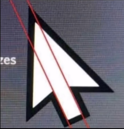
i believe it's just pointing out the misalignment of the graphic. people may be under the impression that something like a cursor has mathematically precise proportions, but it does not.
yeah it has kind of an optical balance to it. i don't mind that it's not mathematically perfect because it appears proportional. optics are all that matters, especially in pixel art.
(edit: i guess 'pixel art' isn't correct anymore because it's a vector graphic, but it used to be pixels!)

