Welcome to Incremental Social! Learn more about this project here!
Check out lemmyverse to find more communities to join from here!

celeste ,

Someone pls explain?

Dagwood222 ,

I'd like to know...

cobwoms ,

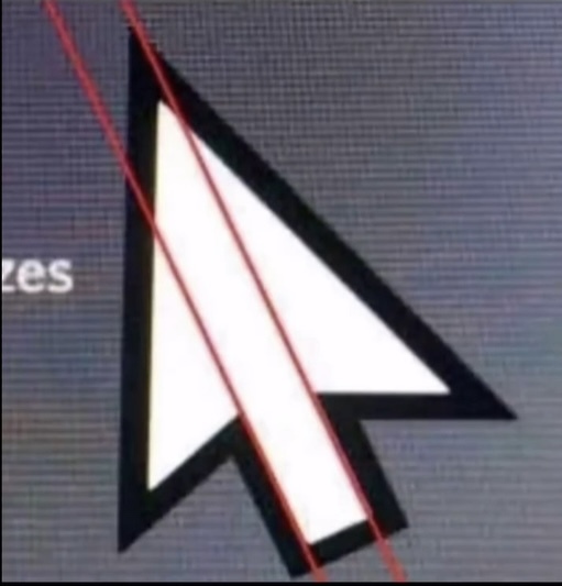
i believe it's just pointing out the misalignment of the graphic. people may be under the impression that something like a cursor has mathematically precise proportions, but it does not.

Dagwood222 ,

thank you

SzethFriendOfNimi ,

And it’s by design. Because if it was absolutely precise the edge wouldn’t have been straight

https://www.makeuseof.com/windows-default-cursor-why-asymmetrical-tilted/

cobwoms ,

yeah it has kind of an optical balance to it. i don't mind that it's not mathematically perfect because it appears proportional. optics are all that matters, especially in pixel art.

(edit: i guess 'pixel art' isn't correct anymore because it's a vector graphic, but it used to be pixels!)

tyler ,

That doesn’t explain why the tail doesn’t aim at the point, it just explains why the cursor is tilted to the side.

badcommandorfilename ,

Nor does it explain the irregular angles - it mentions a 45° cursor, but if it was 45° the tip would be aligned with the tail.

WhereGrapesMayRule ,

So gay!

Zozano ,

It's only gay if you receive the click, not send it.

veroxii ,

What about a double click?

Zozano ,

Depends if you've plugged two mice in at the same time, or if they are taking turns.

nick ,

God damn it

burgermeister ,

What the fuck, I will never look at things the same way again.

Pantherina ,

Breeze (KDE) cursor forever!

sleen ,

Excellent choice

turbowafflz ,

I don't really like the breeze cursor, it's just the oxygen one but flattened and it doesn't look as nice.

Pantherina ,

I have to say the "everything flat" was kind of a weird process. I think it looks better than in the old chaotic days. But something in between is best.

Pantherina ,

I have to say the "everything flat" was kind of a weird process. I think it looks better than in the old chaotic days. But something in between is best.

Pantherina ,

I have to say the "everything flat" was kind of a weird process. I think it looks better than in the old chaotic days. But something in between is best.

Pantherina ,

I have to say the "everything flat" was kind of a weird process. I think it looks better than in the old chaotic days. But something in between is best. Not sure what that is, at least from screenshots KDE looked worse than Windows XP/7

ProgrammingSocks ,

macOS Catalina is probably my favourite OS design, as a Linux user. No unnecessary padding like Big Sur and onwards, not overly flat like many older versions, everything clickable looks clickable, it's great.

Pantherina ,

I have to say the "everything flat" was kind of a weird process. I think it looks better than in the old chaotic days. But something in between is best. Not sure what that is, at least from screenshots KDE looked worse than Windows XP/7. Now Windows 11 looks better than KDE, time for some new icons!

CurbsTickle ,

I'm so confused by the one person replying to you with 5 slight variations of the same comment....

germtm_ ,
@germtm_@lemmy.world avatar

good choice, but i'm a Bibata enjoyer myself.

RagnarokOnline ,

Wtf?!

PunnyName ,

I'm okay with this.

jared ,
@jared@mander.xyz avatar
TheDoozer ,

I think my favorite part of that is the pair of tiny hands passing that double deuce right back.

LinkOpensChest_wav ,
@LinkOpensChest_wav@lemmy.dbzer0.com avatar

Destroy all technology

It's time to start over

If you need me, I'll be hunting and gathering

BautAufWasEuchAufbaut ,
@BautAufWasEuchAufbaut@lemmy.blahaj.zone avatar

OK but what about HRT

LinkOpensChest_wav ,
@LinkOpensChest_wav@lemmy.dbzer0.com avatar

That we can keep

lnxtx ,
@lnxtx@feddit.nl avatar

Yeah, the fonts are lying to me all the time.

Kase ,

Squeezing a square about 1% helps it look more like a square; to appear the same height as a square, a circle must be measurably taller. The two strokes in an X aren't the same thickness, nor are their parallel edges actually parallel; the vertical stems of a lowercase alphabet are thinner than those of its capitals; the ascender on a d isn't the same length as the descender on a p, and so on.

https://lemmy.world/pictrs/image/fa0373bf-ada6-4c8e-bc4d-e778d1f72cb1.jpeg

Blahaj_Blast ,
@Blahaj_Blast@lemmy.blahaj.zone avatar

FUCK

YOU

jerrythegenius ,
@jerrythegenius@lemmy.world avatar

ಠ⁠_⁠ಠ

Sanctus ,
@Sanctus@lemmy.world avatar

Yeah if you use mcrosft 🤮

preussischblau ,
@preussischblau@lemmy.ca avatar

M*cros*ft

LazaroFilm ,
@LazaroFilm@lemmy.world avatar

The name always made me think of a penis.

Jerb322 ,
@Jerb322@lemmy.world avatar

Sorry...

starman2112 ,
@starman2112@sh.itjust.works avatar

"Why'd you name your company after your dick?"

voodooattack ,

“You blow, Jobs, you arrogant prick…”

miss_brainfarts ,

I use Adwaita cursors on Windows, so

Risus_Nex ,

It's a design choice! Engelbert & English probably thought real hard about this little "offset". To bring in more dynamic or something!

Rai ,

I like it because it points up, not straight.

Everyone loves a good upcurve.

starman2112 ,
@starman2112@sh.itjust.works avatar

Look it's totally normal for it to curve a little bit okay

KingThrillgore ,
@KingThrillgore@lemmy.ml avatar

If it curves too much you may have a disorder that can be treated with medicine.

  • All
  • Subscribed
  • Moderated
  • Favorites
  • 196@lemmy.blahaj.zone
  • incremental_games
  • meta
  • All magazines